
Great penmanship has always been something I’ve admired. Ever since I was little, I remember being fascinated by handwriting.
Growing up, I would copy the handwriting of my classmates—especially the ones that looked neat or interesting. Some were big. Some were bubbly. Some were tiny.
In doing so, fourth-grade me was unknowingly building the foundation for the handwriting I have today. Not yet the skill to invent a unique style from scratch, but the ability to copy and internalize different “fonts” for everyday analog writing.
The cursive
For the latter half of high school and into most of my adult life, I wrote in cursive. I always cringed when I had to print—my printed letters looked wonky, and I always felt a little embarrassed when filling out government forms or bank paperwork. I was unsatisfied with the result, every time.
I’m not sure why I gravitated toward cursive. Maybe it was because it stood out. Maybe it was the compliments I received. Maybe I liked how it wasn’t easy for other people to read—like I was writing in plain sight, but still in secret. My own cryptic alphabet, formed in loops and swoops.
In my teenage years, I also developed a strange fascination with World War II—thanks to Day of Defeat (an ancient Counter-Strike mod), Saving Private Ryan, and Band of Brothers. I remember being especially drawn to the handwritten journals from that era. Most of them were written in cursive.
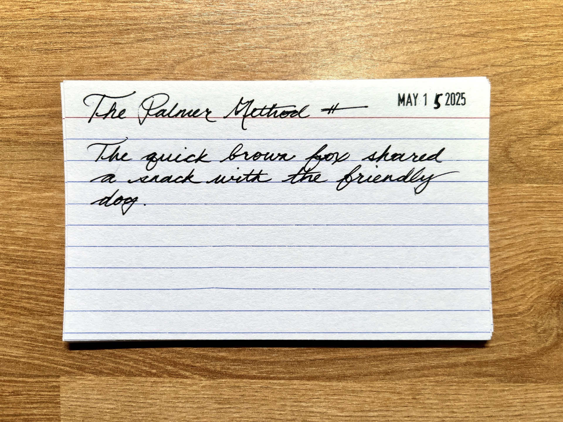
Years later, I discovered the Palmer Method—a penmanship system developed in the late 1800s and popularized through the early 1900s. It’s the same writing style used in many of those wartime journals. I was hooked.
The architect
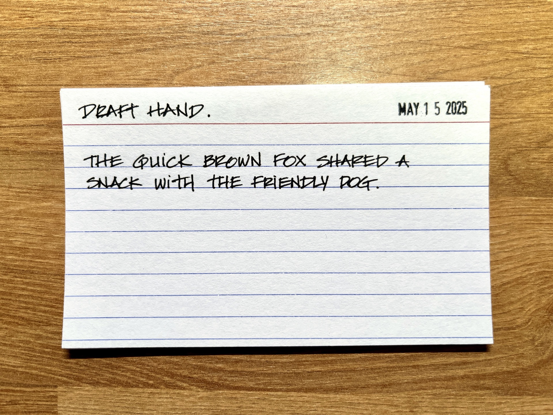
After years of cursive, I hit a wall: no one could read my writing. And on top of that, I felt too much pressure to make every loop and curve look elegant. So, about four years ago, I made the switch—from swirly to straight. From Palmer to printed.
I flipped through my mental library to find a new font to copy. That’s when I realized: I really liked how blueprints looked. The architecture diagrams, annotations, ruled lines—it all looked so precise.
Then I found out: this wasn’t a digital font. This was a handwriting style. Draft hand.
So I practiced. And practiced. And practiced.
I drilled letterforms and numbers. Wrote full sheets of alphabets. Pages of nonsense. It took a surprising amount of effort to undo decades of muscle memory. But eventually, I got it. Printing became my new default.
And now, whenever I write, I pretend—just a little—that I’m an architect.
The straight and narrow

There was still one problem. Draft hand took up too much horizontal space. The letters were too big. I liked the precision, but not how much real estate it required.
So I started searching again. I wanted something like draft hand—but narrower. A next evolution. Eventually, I stumbled across the handwritten collection of American cartoonist Alex Toth.

Comic book lettering. Printed, easy to read, and full of character—without looking like Comic Sans. I gave it a shot. Fell in love right away. It had both precision and personality.
But it was still a bit too wide for my taste.
That’s when I found Laura Kampf’s handwriting.
I’d been a fan of Laura for years, but for some reason, I hadn’t paid attention to her handwriting until now. I guess I wasn’t ready to study it. When I finally did, I was pleasantly surprised to find a YouTube video of Laura explaining her handwriting—talking about her own journey to experiment, refine, and eventually find a style that felt right.
Her writing was straight and narrow—but not boring. It was undeniably Laura.
That’s when I knew: I wanted to make it mine, too.
And that’s when my handwriting shifted again—from precise with personality to something with a bit more play.
The playful

In late 2021, my note-taking and archiving habits really took off. I wanted to collect things, organize them, and store them in a way that I could find again. So I wouldn’t forget.
Some of that archiving involved deep dives into old blueprints, concept art, and early patents from Disney. Back when Walt and the Imagineers were transitioning from animation to building something bigger: a theme park.
That’s when I noticed something about Walt’s handwriting. Specifically, his signature. The D.
You probably know it—the swoopy, playful D from the Walt Disney logo at the beginning of all those childhood movies: The Lion King, Pocahontas, Mulan.

I instantly absorbed it into my own.
This was the first time I didn’t copy an entire font. Just a piece. A single letter. My first remix instead of a cover.
And then came another remix.
I started studying the hand lettering of New York artist Tom Sachs. His writing had this wild duality—messy but clear. I think it perfectly reflects his art. As I would describe it: “Scrappy, not crappy.”

One day, I was watching an Adam Savage video where he introduced Tom’s space program—and that’s when I noticed it: Tom’s distinctive lowercase i.
I loved it.
I brought it in. Another remix.
In a world of ALL CAPS, that lowercase i stood strong. A tiny reminder that it’s okay to be playful. Okay to be different. You don’t have to be big to stand out.
The expressive

Earlier this year, I was watching YouTube videos about pocket notebooks (as one does). One person mentioned that they carried multiple notebooks and credited the idea to someone named Austin Kleon.
Huh. Austin Kleon. I’ve heard of Steal Like an Artist—though I’ve never read it. (It’s sitting next to me right now.)
I looked him up.
And wow. How did I not know about Austin Kleon?!
If you’ve seen his work, then you know his handwriting. Bold. Distinctive. Unapologetically expressive. His brush pens, stamps, zines — it’s handwriting on a mission.
That was it. His style unlocked something new for me.
And that’s where my handwriting lives today. A little bounce. A little swing. Austin Kleon’s expressive energy stacked on top of the playful foundations of Walt Disney and Tom Sachs. All built on the scaffolding of Alex Toth and Laura Kampf. Grounded in the architectural clarity of draft hand.
The font
Where will it go next? Who knows.
But after so many years of studying, scribbling, remixing, and refining—I feel like I’ve finally made something special. A style that feels true to me.
This is my handwriting.
And if you’re curious—I actually turned it into a font. You can find it on GitHub for free.

The inspo
I’ve been meaning to write this post for a while. I guess it all started with a little sticky note I scribbled on February 18, 2025 at 2:59 PM.
